
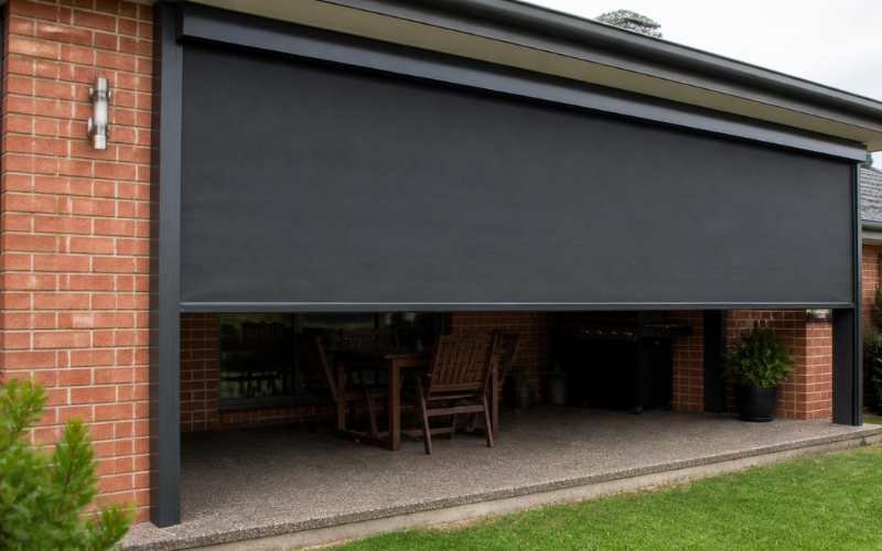
The best verandah blind colour depends on your home’s exterior material, not just on your personal taste. Weatherboard homes need blinds chosen to match a paint undertone that can change over time, while brick homes need blinds matched to a fixed, unpaintable base colour. Getting this wrong can make a verandah look bolted on rather than built in, no matter how good the blind itself is.
Most colour guides treat every home the same way, offering only a generic list of “safe” shades. But weatherboard and brick behave very differently once a blind fabric is fitted against them. Weatherboard is painted, textured, and often has warm or cool undertones that shift the perception of nearby colours. Brick is fixed, textured in its own way, and can’t be repainted without major cost. So the blind has to work around it rather than with a colour that can be changed.
At OZ Roller Shutters, we treat verandah blind colour as one of the few low-risk styling decisions a homeowner can make without touching the house itself. Get the fabric colour right, and it can instantly lift a weatherboard or brick home. Get it wrong, and it’s an easy, affordable fix.
Key Takeaways
- Weatherboard homes should choose blind colours that account for the paint’s undertone (warm or cool). Since clashing undertones make the blind look mismatched even if the shade itself is close.
- Brick homes should treat the brick colour as fixed and unchangeable, and select a blind that either tones with it or deliberately contrasts against it, not a shade that fights it.
- Matching, contrasting, and tonal blending are three distinct colour strategies, and each suits a different home style.
- Darker blind fabrics absorb more heat and can fade faster on west-facing verandahs in Melbourne’s harsh summer sun, so colour choice also affects comfort and blind lifespan.
- Verandah blinds don’t need to match the roof exactly, trim and window frame colours are usually a more reliable colour anchor.
What Colour Verandah Blinds Suit a Weatherboard Home?
The best outdoor blind colour for a weatherboard home is one that matches the paint’s undertone, not just its shade. Weatherboard homes are painted, and paint carries either a warm undertone (cream, ivory, warm grey) or a cool undertone (blue-grey, pure white, charcoal). A blind fabric with the opposite undertone will clash, even if the two colours look similar on a swatch.
For warm-toned weatherboard (cream, beige, soft yellow), look for blind fabrics in warm taupe, sandstone, or soft olive. These sit comfortably against the existing warmth instead of fighting it.
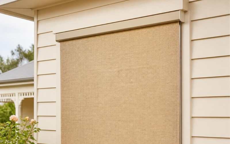
For cool-toned weatherboard (white, grey, blue-grey), charcoal, slate grey, or cool taupe blinds work best. Cool tones amplify each other cleanly, without introducing a clash.
A quick way to check undertone: hold a white sheet of paper against the weatherboard in daylight. If the paint looks slightly yellow or pink next to it, it’s warm-toned. If it looks slightly blue or grey, it’s cool-toned.
What About Heritage Weatherboard Homes?
Heritage weatherboard homes suit muted, heritage-accurate blind colours rather than modern brights. Victorian and Federation-era weatherboard homes in Melbourne suburbs like Brunswick, Northcote, and Kew are often finished in heritage palettes. Colours like deep green, oxide red, cream, or charcoal. Blinds in bottle green, heritage red, or oatmeal keep the verandah in period, while a bright white or bold navy can look out of place against these older facades.
What Colour Verandah Blinds Suit a Brick Home?
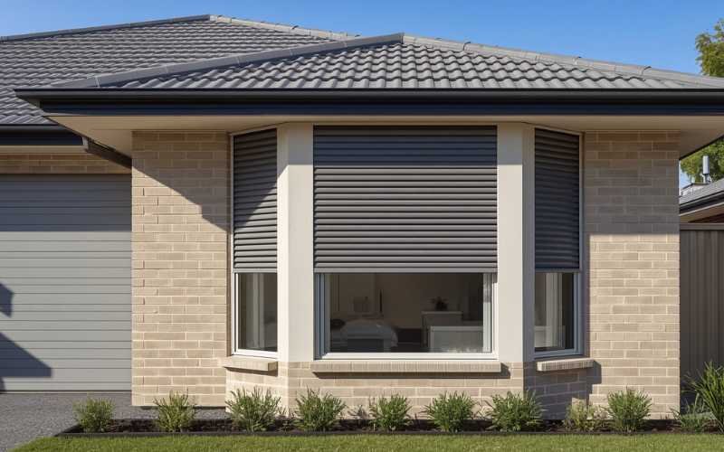
The best verandah blind colour for a brick home works with the brick’s fixed colour, since brick can’t be repainted without significant cost. Unlike weatherboard, brick is a permanent base colour that the blind must be chosen around.
How Do You Match Blinds to Red Brick vs Grey or Cream Brick?
| Brick Colour | Recommended Blind Colours | Why It Works |
|---|---|---|
| Red brick | Charcoal, black, forest green | Dark, cool tones contrast cleanly against warm red, avoiding a clash |
| Cream/sandstone brick | Warm taupe, driftwood, soft grey | Tonal blending keeps the look cohesive and understated |
| Grey brick (modern builds) | Charcoal, graphite, deep navy | Reinforces the contemporary, monochrome palette |
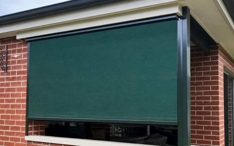
| Exposed/rustic brick | Olive, rust, warm brown | Earthy tones complement the brick’s natural texture |
Red brick is the most common clash risk in Melbourne’s established suburbs. A bright or warm-toned blind next to red brick competes with it, whereas charcoal or black lets the brick remain the visual feature.
Should Verandah Blinds Match or Contrast the House Colour?
Verandah blinds can either match, contrast, or tonally blend with the house colour, and the right choice depends on the home’s style. These are three distinct strategies, not personal preference alone.
- Matching: The blind colour closely mirrors the house colour. Best for homes that already have a strong, cohesive palette and don’t need a visual break.
- Contrasting: Blind colour is deliberately different from the house colour, often darker or bolder. Best for contemporary homes that want a defined outdoor “room.”
- Tonal blending: Blind colour sits in the same colour family but a shade or two apart. Best for most weatherboard and brick homes, since it adds depth without looking mismatched or overly bold.
Tonal blending is the safest default for most Melbourne homes because it avoids both extremes: a blind that disappears into the house and one that looks like an afterthought.
Does Blind Colour Affect Heat and Sun Performance?
Yes, darker verandah blind colours absorb more heat than lighter colours, which affects both comfort and the fabric’s lifespan. Dark PVC (polyvinyl chloride, a common blind fabric) or mesh fabrics absorb more solar radiation, meaning the verandah space can feel warmer on hot days compared to a lighter fabric in the same position.
This matters most on west-facing verandahs, which catch the harshest afternoon sun in Melbourne’s summer. A dark charcoal blind on a west-facing brick home will look sharp, but it will also run hotter than a lighter grey in the same spot.
Do Dark-Coloured Outdoor Blinds Fade in the Sun?
Yes, dark-coloured outdoor blinds generally fade faster than lighter colours under prolonged UV (ultraviolet) exposure, although quality fabric significantly slows the process. UV exposure breaks down fabric dye over time, and darker pigments fade more visibly than lighter ones because the colour shift is easier to notice against a darker base.
The key to how well any hue dark or light, holds up after years of Melbourne sun is to choose a UV-stabilised, quality outdoor fabric, not a cheaper substitute.
Should Verandah Blinds Match the Roof or the Trim Colour?
Verandah blinds should generally match the trim or window frame colour, not the roof. Trim and window frames sit at eye level and are seen up close, alongside the blind, making them a far more visible colour reference than a roofline viewed from a distance.
Roof colour matters more for overall street appeal from afar, but it rarely interacts directly with the blind fabric the way trim does. Matching or tonally blending with the trim colour keeps the verandah looking like part of the home’s design, rather than a separate addition.
How Do You Choose the Right Verandah Blind Colour for Your Home?
Choosing the right verandah blind colour comes down to one core decision: work with your home’s materials, not against them. Weatherboard homes need a blind colour chosen to match the paint’s undertone. While brick homes need a blind that respects a fixed, unpaintable base colour. Tonal blending is the safest choice for most Melbourne homes, and trim colour is a more reliable guide than the roof colour.
At OZ Roller Shutters, we help Melbourne homeowners choose verandah blind colours that suit their exact home. Whether it’s a heritage weatherboard cottage in Northcote or a modern brick build in the outer suburbs. Our range of outdoor blinds comes in various UV-stabilised fabric colours. You can get the tonal match right the first time, without guesswork or costly trial and error. And if your verandah could also use extra weather protection or security, our roller shutters and security doors are designed to complement the same colour palette. This gives your whole home a consistent, considered look. Also, we provide security doors and roller shutters for extra protection.
Ready to find the right blind colour for your home?
Get in touch with OZ Roller Shutters for a free measure and quote, and our team will help you match your verandah blinds to your home’s exterior.